

Helvetica vs. Arial: Do You Know the Difference?


The differences in the cap R make it one of the easiest ways to tell Helvetica (in white) from Arial (in pink), particularly the design of the leg of the R.
Helvetica and Arial are the names of two typefaces known to just about every designer, as well as many non-professional computer users. You can see these fonts in print, on the web, and in other digital media, such as movie titles, eBooks, apps, and the like. While the two might seem similar at a glance, they are most definitely different in history, design, and intended usage. While many designers have strong opinions about one or the other, most would be hard pressed to tell you exactly what the differences between them are. Here is the story!
Helvetica History
Helvetica is the older of the two fonts, with its beginnings in print. It was originally designed by Swiss typeface designer Max Miedinger in 1957 for the Haas Type Foundry in Switzerland. Managing director Eduard Hoffmann commissioned it to be a neutral, legible, sans serif typeface and to compete with other popular sans serifs of the day, specifically Akzidenz Grotesk. This new design was subsequently named Neue Haas Grotesk (meaning “New Haas Sans Serif”) to reflect its origin.
When Linotype acquired Haas’s parent company, the Stempel Type Foundry, they changed Neue Haas Grotesk’s name to Helvetica (an adaptation of “Helvetia,” the Latin name for Switzerland) to reflect its Swiss heritage. Linotype added more weights and versions, after which the renamed and newly expanded family was heavily promoted.
The popularity of Helvetica soared when Apple selected it for inclusion in the core fonts for its operating system and laser printers, alongside Times Roman and Courier. This was the beginning of the desktop publishing revolution, which changed everything related to typography and design. Helvetica has since gone on to become one of the most well-known and widely used typefaces in the world.
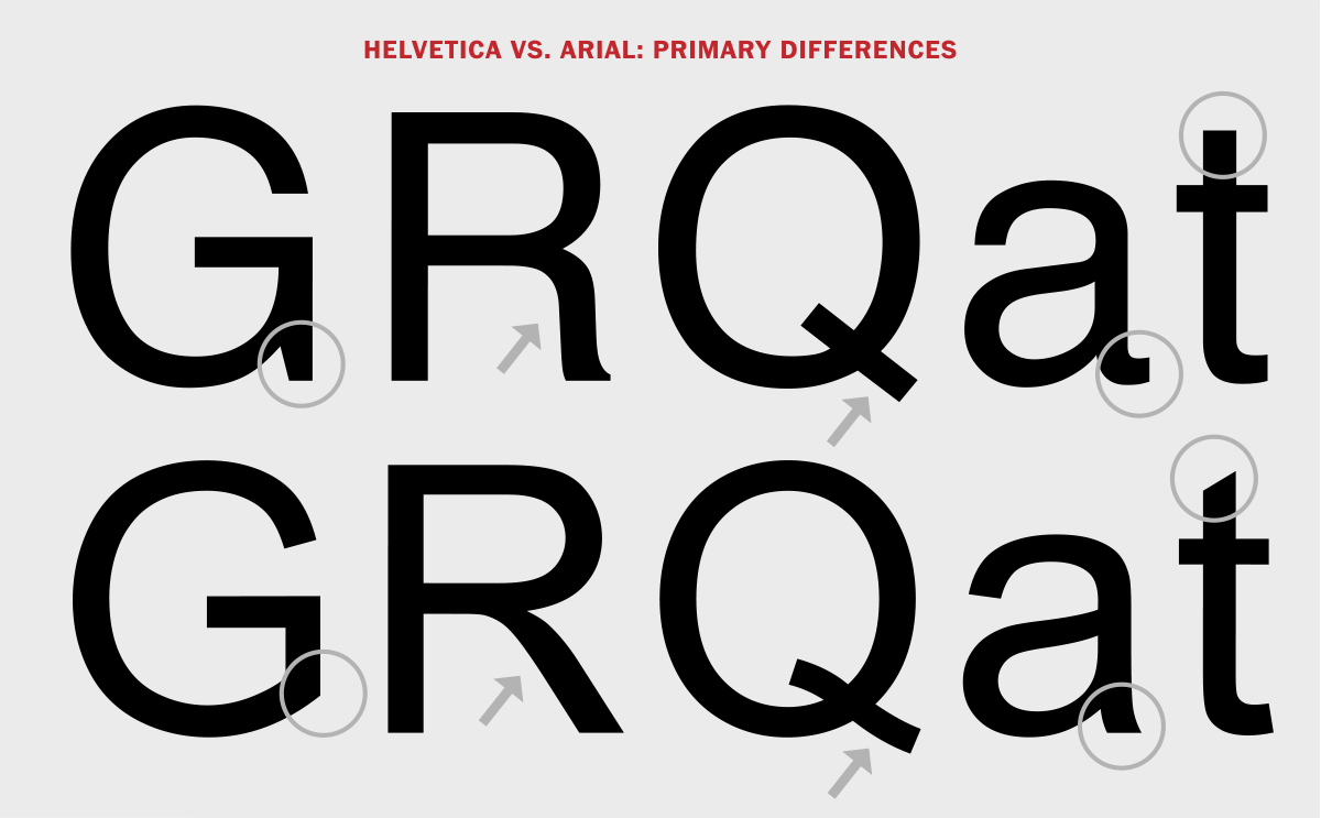
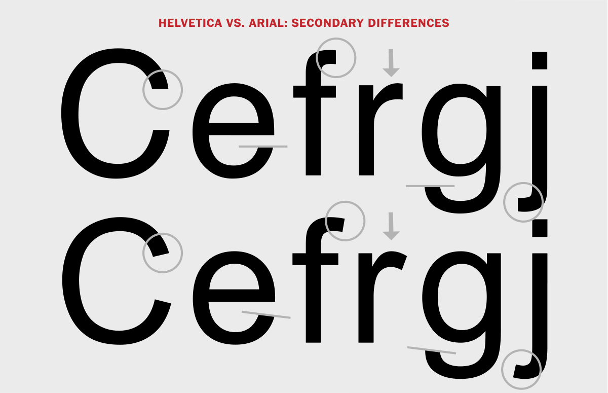
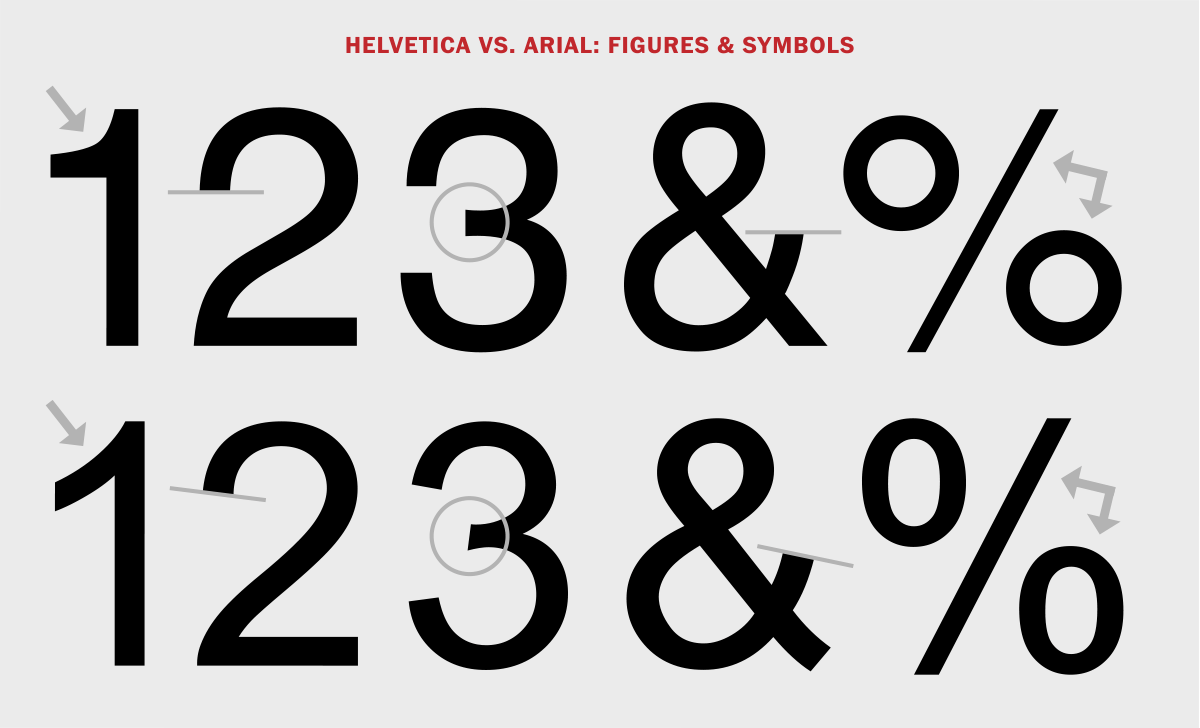
The next three illustrations identify both the major and minor differences between the two typefaces, with Helvetica on top and Arial on the bottom.
Arial History
Arial has quite a different history. Around the same time that Adobe was developing PostScript, Monotype won the contract to provide fonts for IBM’s first big laser-xerographic printers. This led to the design of Arial by Robin Nicholas and Patricia Saunders for Monotype Typography in 1982. One of the goals of Arial was to compete with Helvetica, but also to be its own design with unique details more suitable to the lower resolution technology of that time, including the IBM laser printer. Its roots lie in Monotype Grotesque, a typeface drawn in 1926.
Ten years after the font’s creation, Microsoft licensed Arial to be included in the suite of fonts supplied with the Windows operating system, which led to its increased usage and popularity, most noticeably on the web. The Arial family has since been expanded beyond the original weights to include 28 weights and versions.
Helvetica vs. Arial Design Differences
Although Helvetica and Arial might appear to be similar, they have distinct differences, many of which were chosen to make each typeface more suitable for its intended usage. Helvetica was designed for traditional print, while Arial was designed for laser printers and then adapted for use on computers, both of which are lower resolution environments than professional print work. This led to some subtle (and not so subtle) design changes.
Helvetica is a sharper, crisper design with more stylish details and a slightly more rectangular (or less rounded) appearance. You can see these traits in the leg of the cap R, the curved diagonal on the numeral 2, the more accentuated stroke endings, and the blunt horizontal or vertical end strokes on many characters.
Arial is the more rounded of the two designs, with softer, fuller curves and more open counters. It has an overall less elegant, blander appearance that reproduces well in lower resolutions environments. It has a diagonal terminal on the t, as well as on the numeral 1, and a curved tail on the cap Q.
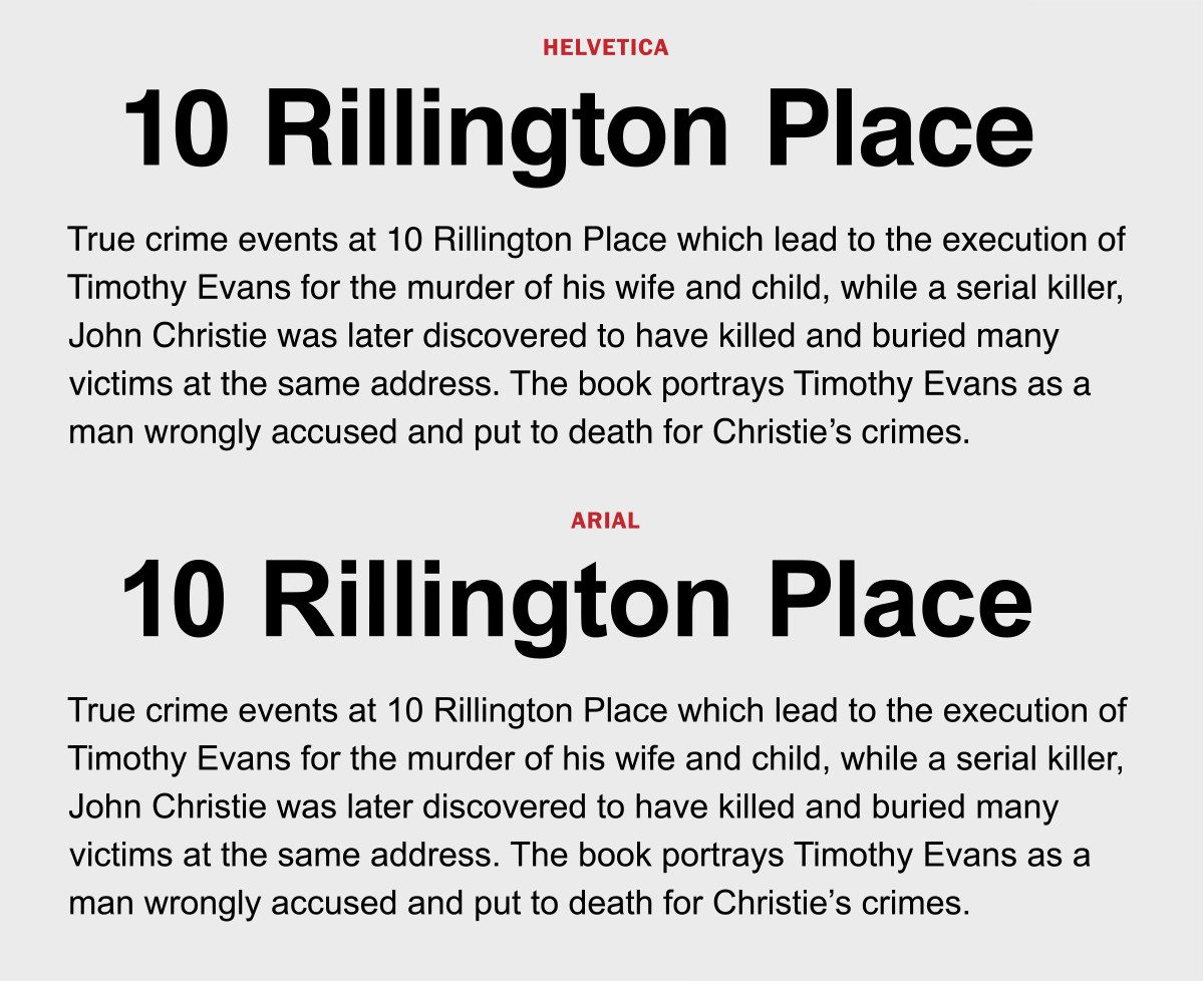
The differences between Helvetica and Arial are much more noticeable in larger sizes, while they look fairly similar in smaller text.
Although both Helvetica and Arial are still extremely popular, Arial tops Helvetica in usage and visibility. This is due to its widespread availability on computers using Windows (that’s over a billion)! But Helvetica still rules among graphic designers, with its universal and almost timeless appeal, multiple weights and versions, as well as the rerelease of Linotype’s reworked and very popular Neue Helvetica typeface (to come in a future article).
Thanks for sharing your knowledge (research). I love learning about typography origins, and appreciate you so much!
The difference between the 2 fonts in smaller sizes is barely perceptible. Isn’t it curious how some designers look down their noses at Arial? If it wasn’t for the differences in some of the capitals, I doubt they’d be able to tell which was which in 9pt body copy. Thanks for pointing this out. (I’ve created an overlapping image comparison in Photoshop that nicely illustrates how minute the differences are… but I can’t upload it here.)
Years ago I saw some Swiss travel posters. beautiful scenic views with very little text. The text was the most beautiful Helvetica I have ever seen.I don’t know why it was so beautiful, but it was.
Helvetica is puzzling because you can find it both on astonishingly ugly signage around town, and also on beautifully modern signage in airports and train stations. I’ve long thought that a key to beautiful Helvetica is probably careful attention to word/letter spacing, leading, and kerning. When someone uses Helvetica at the default settings in a word processor, that’s probably what makes it look horrible on all those posters and signs. But when someone with typographic skill goes in and tunes the spacing, and composes it properly with other elements on the page, we get beautiful Helvetica.
Very interesting article. As a follow-up, I would love to see and article about the difference between Helvetica and Neue Helvetica.
Very, very interesting! Thank you!